
Essential Branding Package
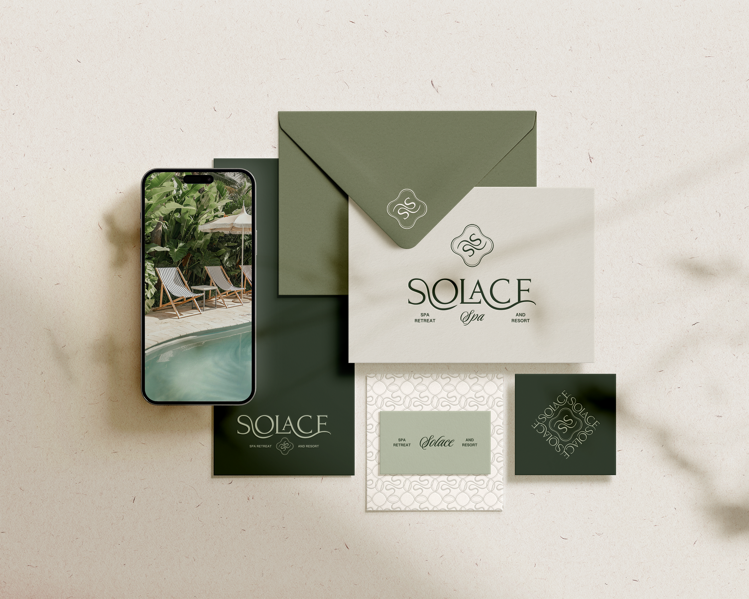
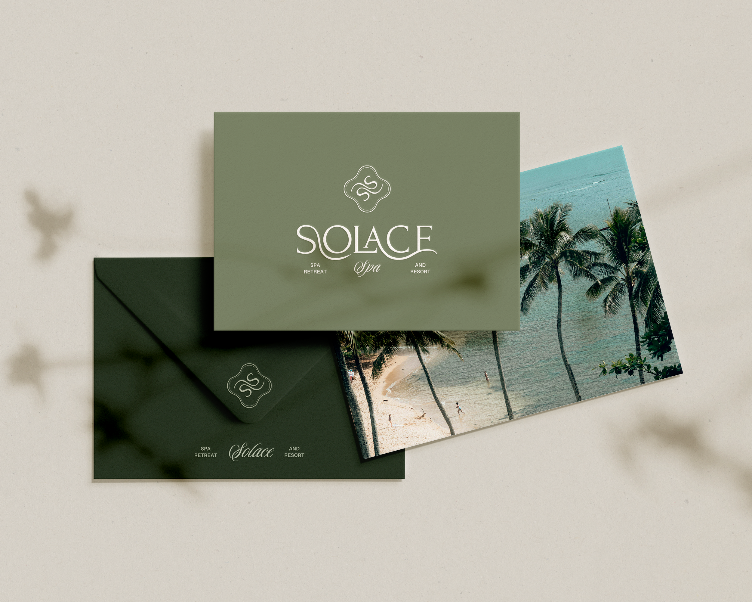
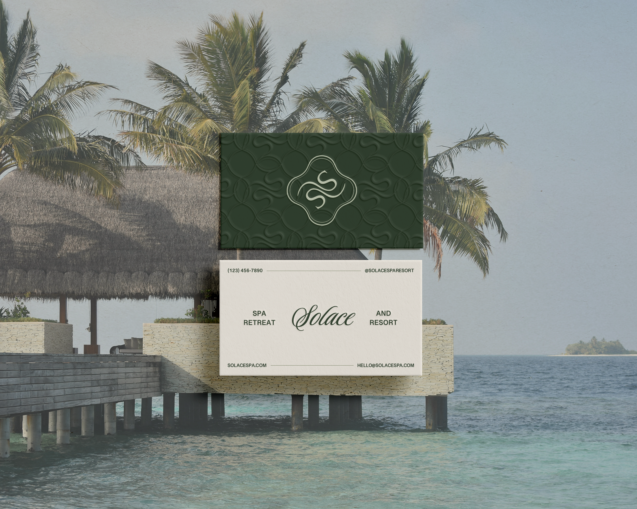
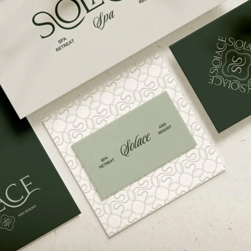
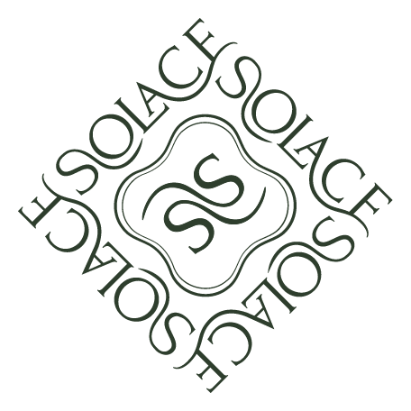
SOLACE SPA
Inspired by the rhythm of nature and the restorative power of water, Solace is a destination where guests are invited to pause, transcend, and begin again. The visual tone is grounded yet ethereal, balancing earthy greens with a flowing logo that embodies both movement and transformation. A return to self through quiet rituals.
Relaxing · Calm · Transformative · Soothing · Elevated · Restorative · Minimalist · Clean · Botanical
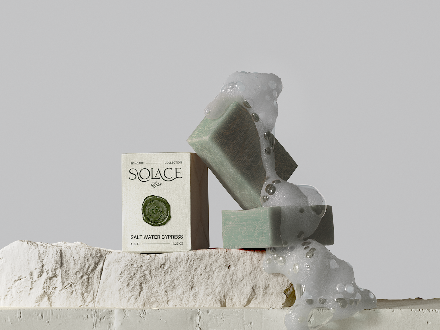
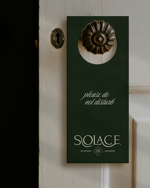
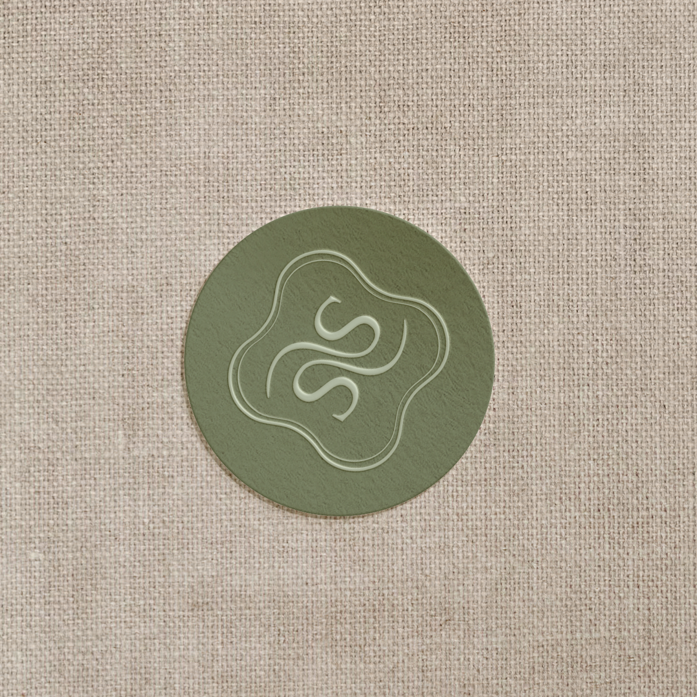
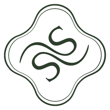
The brand identity is serene, modern, and luxurious, designed to embody balance, calm, and renewal. A palette of forest green, lagoon teal, and earthy neutrals evokes nature and water. The intertwined S logomark flows in harmony, symbolizing movement, balance, and sanctuary. Extended typography and a subtle repeating pattern ripple like water, reinforcing the brand’s essence of tranquility, refinement, and a transformative retreat experience. Subtle details and fluid forms throughout the identity create a sense of understated elegance and immersive calm.
Design Vision
Connection to nature · Mindful relaxation · Immersive wellness · Intentional luxury · Harmony and flow · Transformative care · Serene sanctuary · Restore and renew
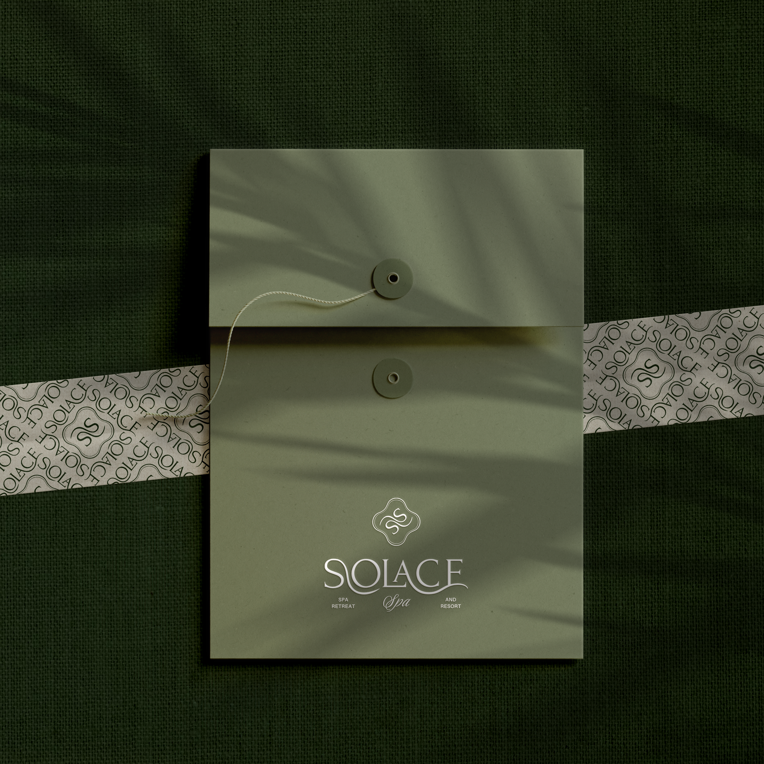
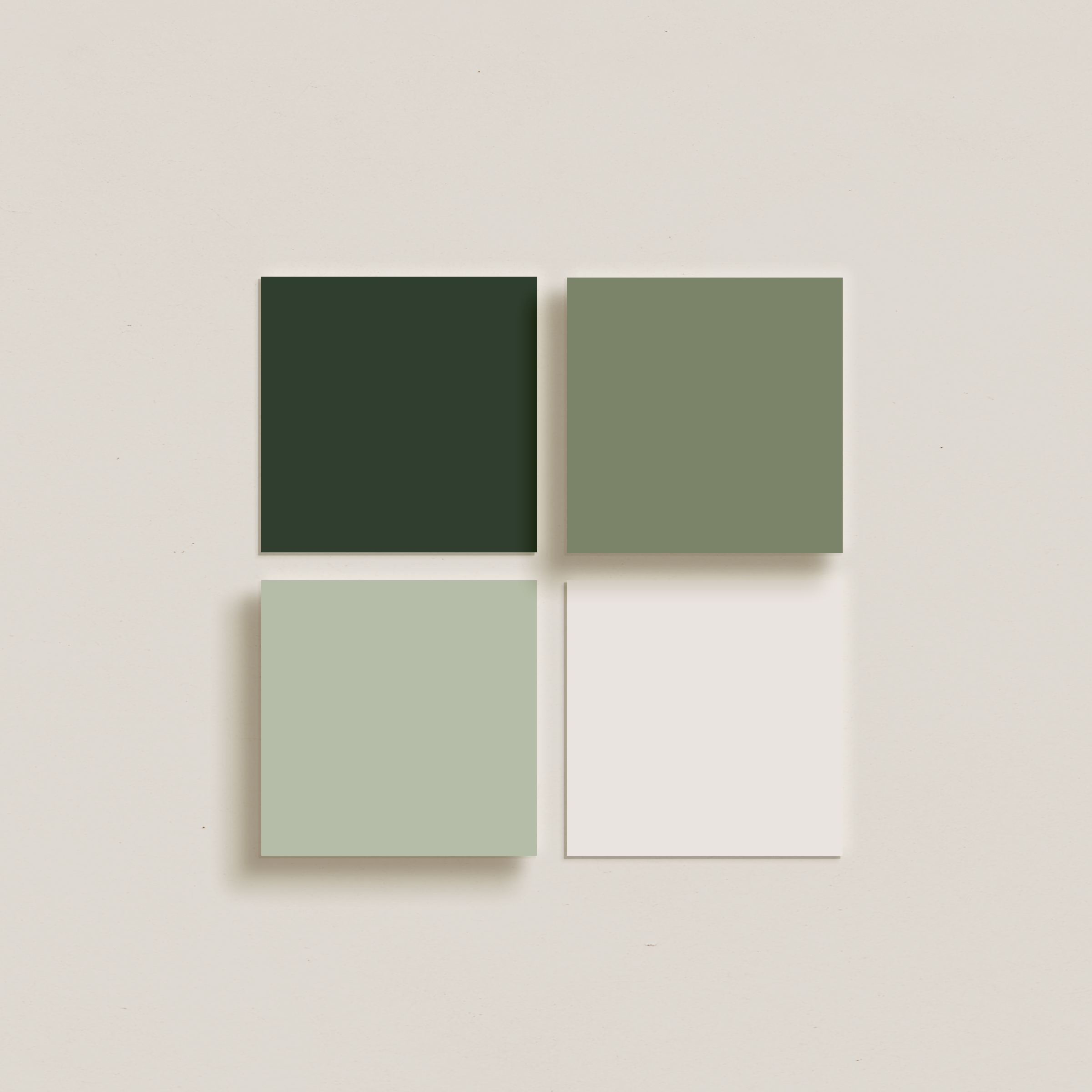
Primary Logo · Secondary Logo · Logomark · Submark · Signature Accent · Custom Brand Pattern · Color Palette · Typography System · Brand Guideline


Return to Portfolio
View Next Project